

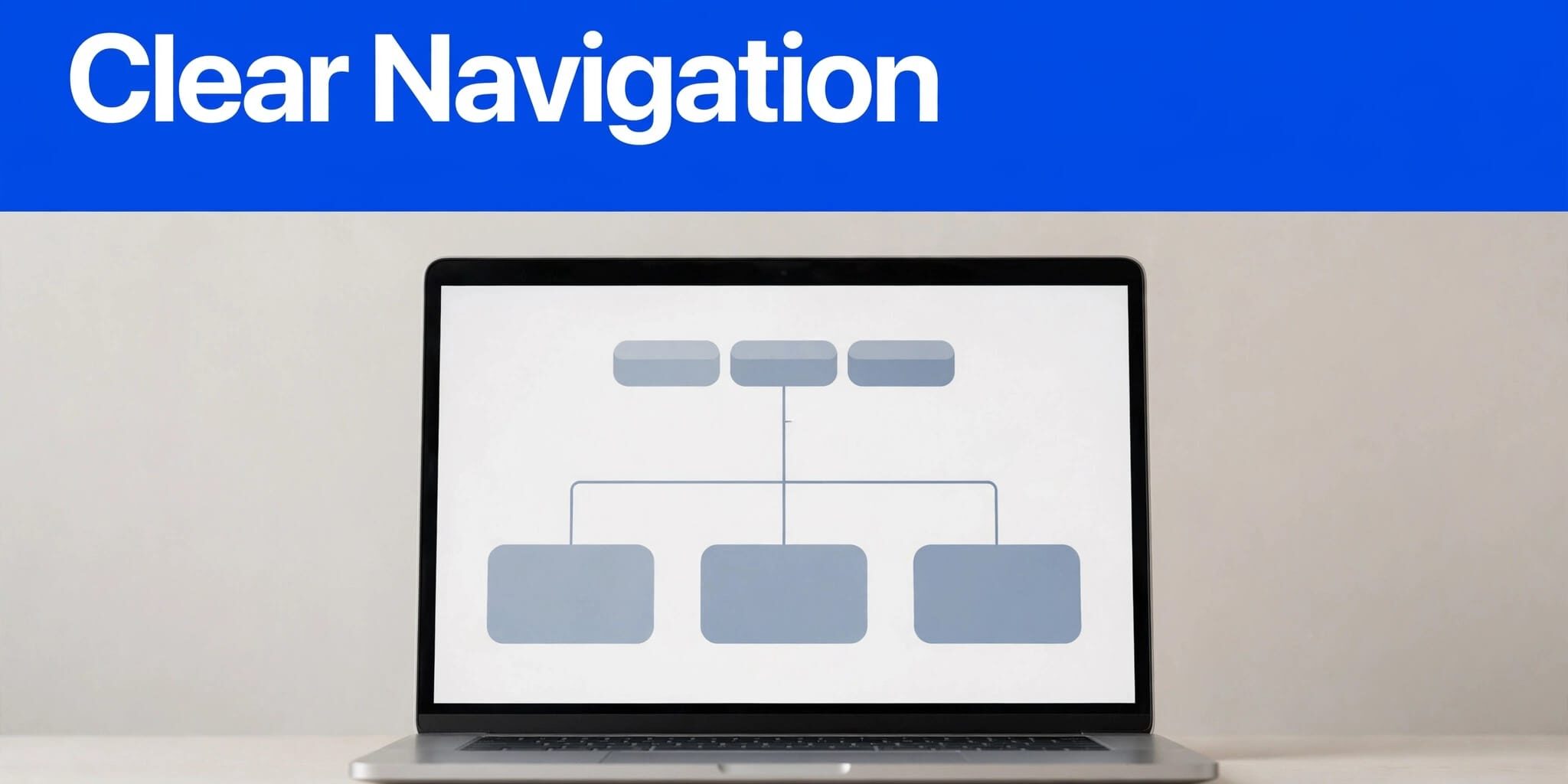
Visitors quickly decide whether your site feels easy to use or frustrating, shaping the user experience from the first click. A clear path to action helps them find services, proof, and contact details without digging through pages.
Your website navigation structure affects more than appearance. It shapes your website structure by defining page relationships and how search engines discover important pages. I start with your target audience’s needs. Using navigation best practices, I make the desktop horizontal navigation bar expose the clearest path to services and contact details. That path may lead to a call, quote request, visit, or purchase.
Key Takeaways
- Build the website structure around pages customers need most, using a simple hierarchical structure instead of listing every page your business owns.
- Keep the navigation menu focused, with service pages, trust-building content, and contact options in logical places.
- Keep navigation elements plain, make the desktop horizontal navigation bar and mobile menu easy to use, and test navigation with a keyboard for accessibility before launch.
- Connect related pages with descriptive internal links so visitors and search engines can follow the same clear paths.
Start With the Business Path
A menu should follow the decisions customers make before they contact you. I don’t treat the homepage as a storage bin for every page. Instead, I use it as the primary branch point in the website structure, directing people to the information they need next.
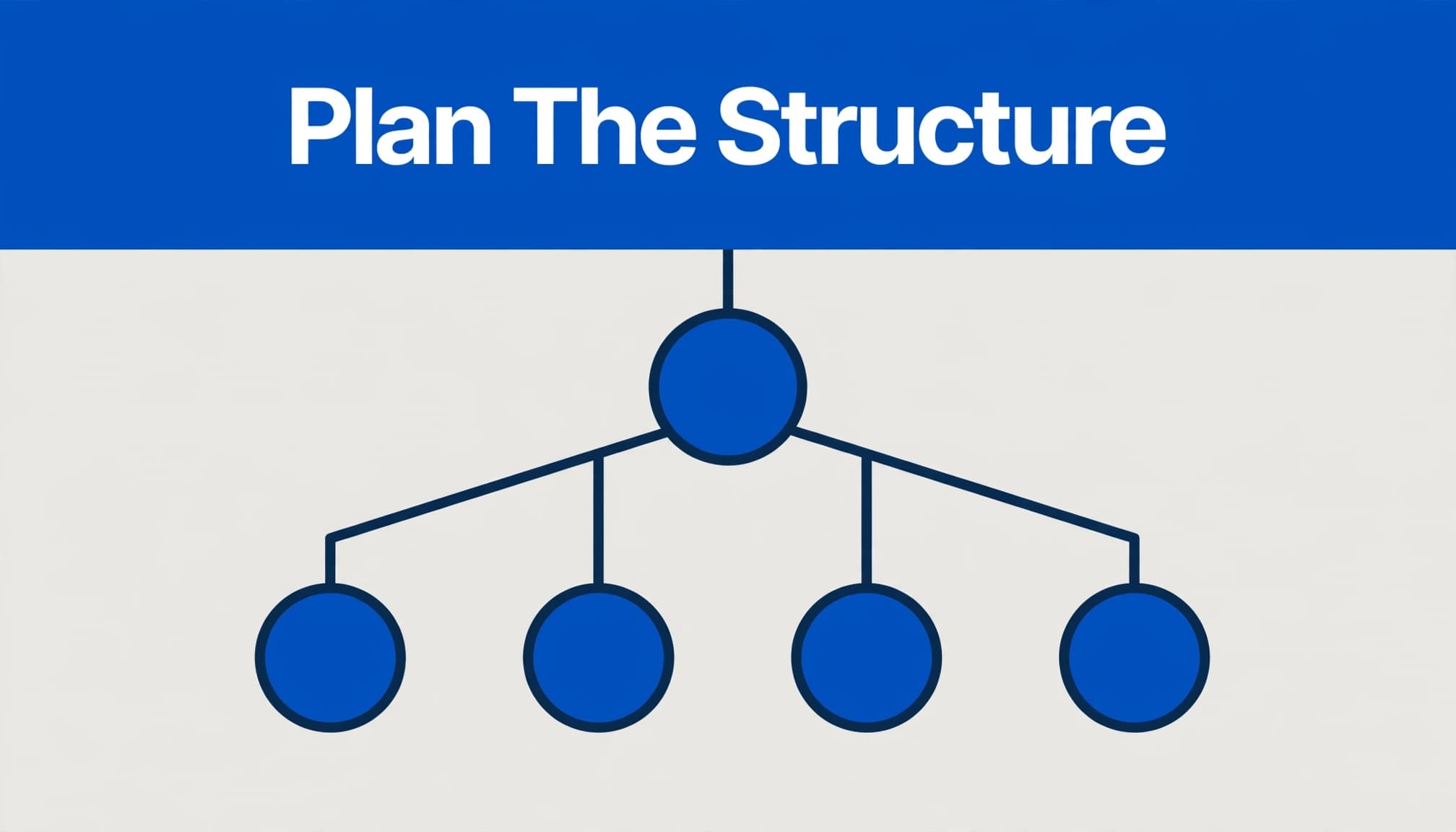
Map customer tasks before menu design
Map the site around the tasks your target audience needs to complete. A local roofer may need visitors to find roof repair, storm damage help, financing information, project photos, and a quote form. A restaurant may prioritize menus, hours, directions, reservations, and catering.
For each proposed page, write one job it needs to do. Service pages should answer buying questions. Testimonials and project galleries should build confidence. Contact pages should make the next step obvious. This task map forms the foundation of your information architecture.
A clear hierarchical structure can guide visitors from broad categories to more specific service pages. That progression keeps website navigation focused and easier to follow.
Use card sorting for unclear categories
When a business has many services or product types, card sorting can reveal labels that make sense to customers. Write each topic on a card, then ask a few customers or staff members to group them naturally. Nielsen Norman Group explains that card sorting research helps teams understand how people expect information to be categorized.
I pay close attention when people group pages differently than the business does internally. Customers may search for “water heater repair,” while the business calls that department “residential plumbing solutions.” The first phrase belongs in the navigation.
Choose a Hierarchical Structure That Fits
Most small businesses benefit from a hierarchical structure. It organizes pages broadly, then moves to specific details while keeping the site layout and user interface easy to understand.
Hierarchical versus matrix structure
A hierarchy starts broad and moves into detail, with sidebar navigation supporting deeper or content-heavy layouts without replacing it. On desktop, a horizontal navigation bar can present top-level categories. A homepage navigation menu may link to Services, About, Reviews, Resources, and Contact, with individual offerings such as AC repair, maintenance plans, or installation under Services.
A matrix structure gives users several ways to reach the same information, creating a more complex information architecture. An online store might let shoppers browse products by brand, use case, price range, or category. This works when a large catalog needs filters and cross-connections. However, it can overwhelm a local service business with only a few core offerings.
Keep linear paths for focused actions
Linear navigation works well for processes that must happen in order. A booking flow, checkout sequence, application form, or multi-step estimate tool should show one clear next step at a time.
For most service businesses, I combine a simple hierarchy with a few linear lead paths. Someone might move from a service page to reviews, then to a contact form. That sequence answers questions in the order many customers ask them.
The best navigation choices reduce decisions at the moment a visitor is ready to act.
Build a Header Menu People Can Scan
Your header navigation menu carries the pages people need on nearly every visit. Navigation elements, including the logo, labels, links, buttons, and dropdown controls, should create a predictable user interface on every page, return users home, and offer a clear contact route. Together, they should reflect your website structure, priority pages, and hierarchy.
Limit primary menu choices
On desktop, a horizontal navigation bar should let visitors scan the header quickly. Navigation best practices suggest five to seven main header links as a useful starting point, not a rigid rule. A three-page startup may need only Home, Services, and Contact. A business with several service lines may need a Services dropdown.
I usually reserve header space for high-priority pages:
- Services or Products
- About, Reviews, or Portfolio
- Locations, when customers visit a physical office
- Resources or FAQs, if they answer frequent pre-sale questions
- Contact, Request a Quote, or Book an Appointment
Avoid vague labels such as “Solutions,” “Discover,” or “More.” A visitor should understand the destination before tapping it.
Use dropdowns and footers with restraint
A dropdown menu can organize closely related service pages. Keep it short enough to scan, and don’t hide the site’s most profitable service pages several levels deep. A mega menu makes sense for large catalogs or content-heavy organizations, but small businesses shouldn’t use a mega menu simply to expose every page.
A footer navigation menu has a different job. It can hold supporting links such as Privacy Policy, Accessibility, Careers, FAQs, service areas, and social profiles. I don’t use the footer as a substitute for the main site architecture. Important pages need links in the header and relevant page content too.
Breadcrumb navigation helps on deeper sites. A trail such as Home > Services > Roof Repair shows visitors where they are and gives them a simple route back to a broader category.
Connect Navigation, SEO, and Lead Paths
Website navigation supports search engine optimization because it connects information, proof, and lead paths. It also affects sales because visitors often need more than one page before they are ready to reach out.
On desktop, a horizontal navigation bar gives visitors a visible path to core service pages.
Link related pages where people need them
Google’s crawlable link guidance explains why standard links help Google discover other pages. Use normal links and descriptive anchor text, such as “emergency plumbing repair” or “Cape Coral office details,” rather than generic phrases.
I connect the homepage to core services first. Then, each service page should point to related services, FAQs, reviews, project examples, location information, and a contact action when those pages answer the visitor’s next question.
For a closer look at this approach, review these local service internal linking strategies. The goal is a short, logical route between information, proof, and action.
Support the structure with clean indexing
A clear website structure supports crawlability through crawlable links and a coherent hierarchy. It cannot repair broken links, slow pages, or unhelpful content. Every important page should have a permanent place in the site hierarchy and at least one relevant internal link pointing to it.
An XML sitemap gives Google another way to understand your pages. Google’s sitemap documentation explains that sitemaps help its crawlers work more intelligently. Still, I treat the sitemap as backup support, not a replacement for useful menus and internal links.
Make Mobile Navigation Easy
Many local visitors arrive by phone, often while comparing businesses or trying to call quickly. If your website navigation feels crowded or hard to tap, the user experience suffers before customers reach a service page.
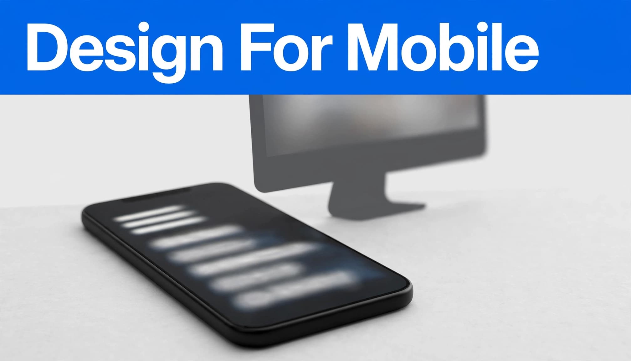
Design the hamburger menu around priorities
A hamburger menu is useful when a horizontal navigation bar no longer fits at narrower widths. Place the menu control consistently, make it large enough to tap, and use a familiar icon. Once open, the navigation menu should show key options without forcing excessive scrolling.
Don’t reproduce an oversized desktop mega menu inside a mobile panel. Keep the contact action visible outside the menu when possible. A phone number, “Request a Quote” button, or booking link may matter more than an About page on mobile.
Test on real screen sizes
I test the hamburger menu on actual phones, not only in a desktop browser preview. Check whether it opens, closes, and lets visitors select links reliably.
Responsive layouts should prevent horizontal scrolling, tiny text, oversized images, and crowded controls. Good mobile responsiveness keeps the site layout usable across screen sizes. Strong responsive website design services bring navigation, page speed, and mobile lead paths into the same build.
Build Accessible Navigation for Every Visitor
Accessible website navigation makes the site easier to use for people who rely on keyboards, screen readers, magnification, or other assistive technology. These checks also expose confusing interactions that affect everyone, improving accessibility.
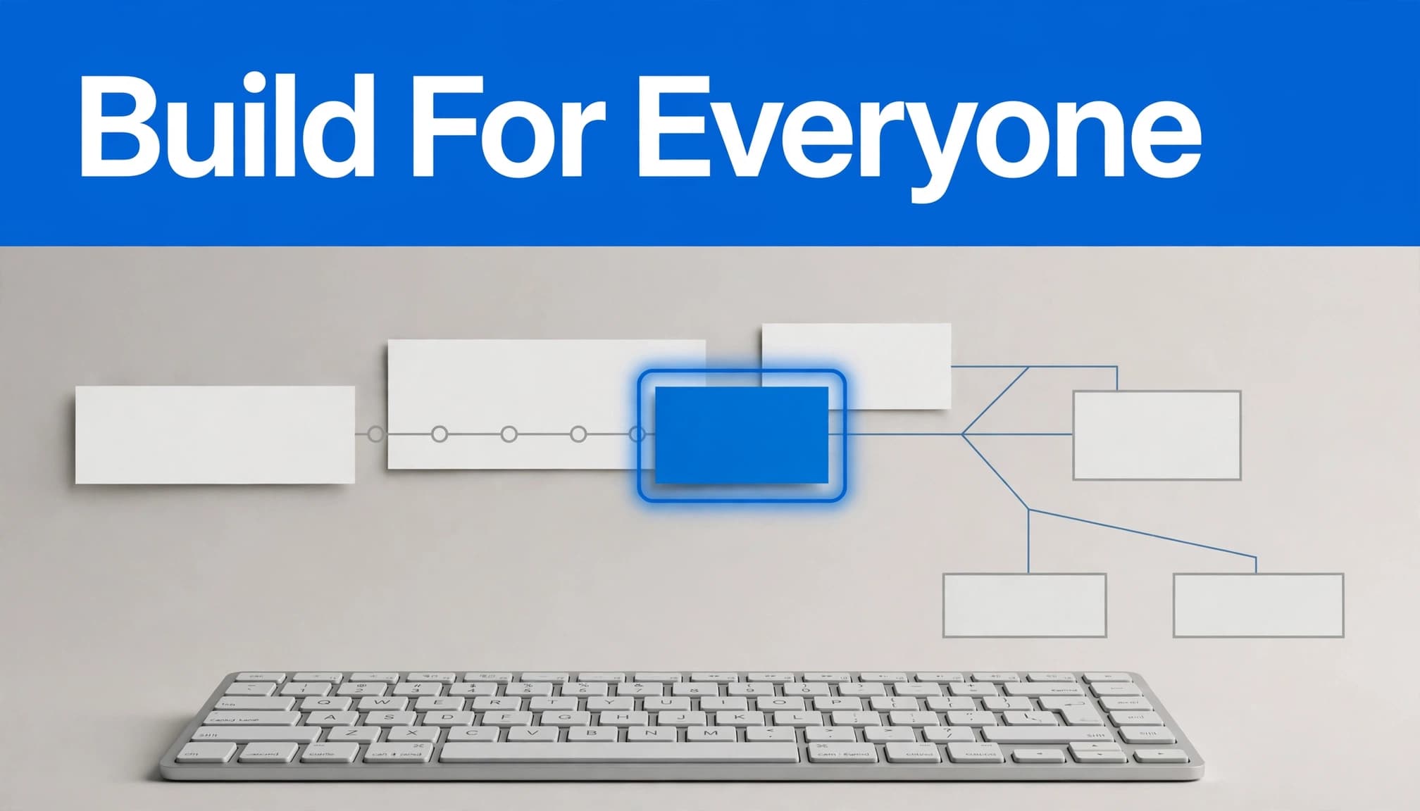
Start with semantic html
Use meaningful HTML landmarks for navigation areas and give multiple navigation sections clear labels. For example, a page may have a primary navigation area and a separate footer navigation menu. Screen-reader users need to tell them apart.
Use the right navigation elements for each role. Buttons should open and close the navigation menu, while links should take people to pages. I avoid building navigation from generic clickable containers because that creates avoidable keyboard and screen-reader problems.
Show the current location and focus
Visitors should be able to see the active page in the menu. Developers can use aria-current="page" and other aria attributes to identify the current item in a set. ARIA supplements native HTML, rather than replacing it. MDN’s aria-current reference also covers its use in breadcrumb navigation.
Test the whole menu with a keyboard, including the desktop horizontal navigation bar. The Tab key should reach every interactive control in a logical order, focus should remain visible, and Escape should close open menus. Don’t rely on color alone to show an active item or an error.
Test the Structure Before and After Launch
Website navigation needs real-world testing because business owners often know their websites too well. What feels obvious to you may confuse a first-time visitor.
Run short task tests
Ask someone unfamiliar with the site who resembles your target audience to complete a task, such as finding a repair service, locating hours, confirming service areas, or requesting an estimate. Test the path through the horizontal navigation bar on desktop, then repeat it with the hamburger menu on mobile. Watch where they pause around navigation elements; this practical test applies navigation best practices to reveal weak labels, missing pages, or buried actions.
I also inspect the site layout on the first screen of each important page. A visitor should see a relevant headline, useful service context, and an obvious next action without waiting through heavy banners or autoplay video.
Review analytics and maintain the paths
Google Analytics can show where people enter, where they leave, and whether visitors follow the intended website structure before conversions. Review these paths after launch, especially for pages receiving traffic from Google Business Profile listings or paid campaigns.
Broken forms, outdated hours, old service descriptions, and dead links can damage trust. A periodic local SEO website audit helps uncover those issues before they cost leads.
Frequently Asked Questions
How many main menu items should a small business website have?
Start with five to seven primary choices, then reduce the number if the menu feels crowded. The right number depends on the business, its services, and the actions visitors need to take.
Do all service pages belong in the header?
No. Place your most important services in the header or a concise Services dropdown. Link to secondary services from relevant core pages, resource articles, FAQs, and location pages.
Are breadcrumbs necessary on every site?
Breadcrumbs help most on sites with several content layers, such as large service catalogs, resource libraries, and multi-location businesses. A simple five-page website may not need them.
Clear Paths Build Better Business Websites
Good website navigation helps customers move forward without stopping to decode your site. Keep the hierarchy simple, give each page a purpose, and connect related content where it helps people decide.
On desktop, a horizontal navigation bar can keep key pages visible. On mobile, a concise menu should make the next step just as clear. I find that the strongest small business sites make contact easy while still answering the questions that come first. Acts 15:19 in the Amplified Bible reminds us to avoid unnecessary obstacles. Consider asking God to remove confusion and make the next step easier for every visitor. If your menu, service pages, or internal links need a reset, Contact Us for a free website and SEO consultation.