

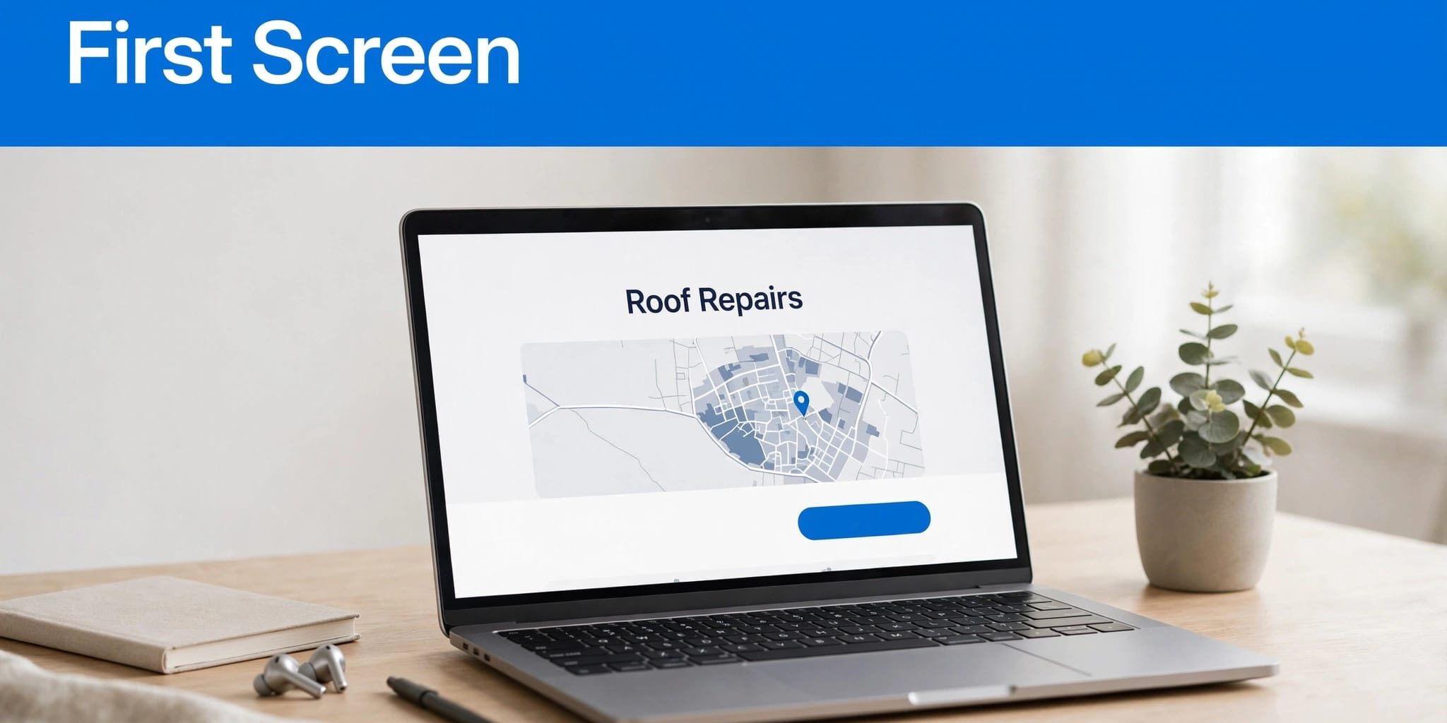
A local buyer’s first impressions often start with your first screen. It should make your service, coverage area, and next step clear without forcing them past a giant banner.
Your first screen can look polished and still leave visitors guessing. I prioritize buyer clarity before animation, decorative headlines, or extra promotions.
That starts with understanding what the first viewport needs to accomplish.
Key Takeaways
- Make the first screen answer what you offer, where you serve, and how buyers can take the next step.
- Put a clear service-led headline, one primary contact action, and relevant proof ahead of decorative elements.
- Check the mobile viewport, page speed, and layout stability so visitors can find and use the contact path easily.
- Measure meaningful actions and lead quality, then test one substantial change at a time.
What above-the-fold website content needs to accomplish
Above the fold means the part of a webpage visible before someone scrolls. The viewport is that visible browser area, and its size changes with the device, browser controls, and screen orientation.
There’s no universal 600-pixel boundary. A headline and button that fit comfortably on a desktop might disappear beneath a tall image on a phone.
I want the opening screen to answer the immediate decision: does this business offer what you need, where you need it?
Then it should provide a usable next step. That could be calling, booking, requesting an estimate, or checking service availability.
Visitors can scroll for detailed explanations, project galleries, and longer testimonials. However, they shouldn’t need those sections to identify your basic offer.
I also review landing pages separately. Someone arriving from an advertisement or Google Business Profile may never see your homepage, so the offer should match the ad placement that brought them there.
Make the service and local coverage unmistakable
A company name doesn’t always explain what you sell. Your main headline needs to state a clear value proposition, explaining what you do and why it matters to buyers.
Lead with the service and buyer benefit
I replace vague welcome messages with plain descriptions of the work. For DMNet Solutions, responsive website design is clearer than simply saying web design, and digital marketing names another meaningful service. “Solutions for your success” would give buyers far less information.
The supporting sentence should explain a practical benefit or an important service detail. Mention mobile-friendly design, online booking, maintenance support, or another feature you actually provide.
Keep claims proportionate. If you offer estimates, say whether they’re free. If pricing depends on scope, explain that visitors can request a custom quote.
You don’t need your full service catalog in the headline. Give secondary offerings clear navigation and dedicated pages.
Distinguish your base from your service area
Local buyers need to know whether you serve them. I state geographic coverage near the offer instead of hiding it in the footer.
For a business based around Fort Myers and Lehigh Acres, those place names provide useful context. However, the wording should also reflect any genuine coverage beyond that area.
A storefront needs an accessible address and current hours. A business that travels to customers needs clear service-area information. Don’t imply you have a branch in every town you serve.
I also compare these details with the Google Business Profile. Conflicting phone numbers, hours, or coverage claims create avoidable uncertainty.
Give ready buyers a direct contact path
A visitor who understands your offer should be able to act immediately. I choose one primary call to action for each page, then match its wording to the buyer’s task.
Match the action to the buying decision
“Request an Estimate” tells visitors more than “Learn More.” For appointment-based services, “Book an Appointment” sets a clearer expectation.
Meanwhile, a buyer needing urgent help may prefer a prominent phone number. Make it tappable on mobile, and identify any limits on availability. Don’t promise round-the-clock service unless you provide it.
If you offer both calls and forms, use visual hierarchy to make one the primary option. Two equally prominent call-to-action buttons can leave visitors deciding how to contact you instead of moving forward.
I also explain what happens after an inquiry. State a response timeframe only when your team can consistently meet it.
Put credible proof near the action
One relevant trust cue can support the contact decision without crowding the screen. I look for a genuine customer review, an applicable qualification, or a real photograph of completed work.
A testimonial is stronger when it names the service or describes the problem solved. Generic praise gives buyers little evidence to evaluate.
Keep ratings and review counts current. Link visitors to fuller proof elsewhere rather than squeezing several badges beside the button.
My local SEO website audit includes checking these contact paths. A convincing first screen loses its value when the phone link or form doesn’t work.
Build the mobile viewport before polishing desktop
I review the first screen on a real phone, not only a resized desktop browser. Browser controls, font scaling, and sticky elements can change what buyers see.
Start with the header. A tall logo area, navigation bar, and promotional strip can consume the screen before your offer appears.
Next, check the content order. On mobile devices, I generally want the headline and short explanation ahead of a large decorative image. The primary contact option should remain easy to find. Keep important page content available on mobile, since Google uses mobile-first indexing.
Responsive design requires more than shrinking everything. Text needs comfortable spacing, buttons need clear separation, and image crops should preserve their subject. These details support a better user experience.
DMNet Solutions’ responsive website design services support layouts across phones, tablets, and desktop browsers. Still, every finished page needs testing across screen sizes.
Reserve space for images and embedded content before they load. Google’s layout stability guidance explains how unexpected movement contributes to Cumulative Layout Shift.
A sticky call button can help mobile buyers, but it needs testing alongside cookie notices and chat widgets. Combined overlays can cover the offer they’re supposed to support.
Keep the first screen fast, responsive, and stable
A page doesn’t have to fail completely to lose an inquiry. Slow page speed, unresponsive buttons, or shifting layouts can make contacting you feel unnecessarily difficult.
Use Core Web Vitals to diagnose friction
I use Google PageSpeed Insights to examine loading problems. When available, real-user data helps show how the page performs for actual visitors.
Google’s Core Web Vitals overview identifies three measures of loading, responsiveness, and visual stability.
These are the current good-experience thresholds:
| Metric | What it measures | Good threshold |
|---|---|---|
| LCP | Largest visible content element loading | 2.5 seconds or less |
| INP | Responsiveness to interactions | 200 milliseconds or less |
| CLS | Unexpected layout movement | 0.1 or less |
Assess these thresholds at the 75th percentile of visits. I treat them as diagnostic targets, not promises of better rankings or more sales.
Fix the largest opening-screen burdens first
Start by resizing and compressing the hero image. A full-width photograph shouldn’t require downloading a much larger file than the display needs.
Google’s Largest Contentful Paint guidance is useful when the main image or headline appears slowly.
I also question autoplay video, oversized sliders, and scripts that compete with the opening content. Keep a visual only when it helps buyers understand the business.
Load nonessential embeds later where practical. However, don’t delay the main image and make the first screen feel slower.
Finally, retest after adding plugins, tracking tools, or major design changes. Performance needs maintenance.
Write search-friendly copy without crowding the page
I use the opening screen to establish the page’s subject, then develop the details farther down. A clear service headline and accurate location wording usually communicate more than a dense paragraph of repeated keywords.
There isn’t a proven search engine optimization shortcut in placing extensive keyword-rich copy above the fold. Useful content throughout the page supports organic traffic, along with accessible navigation and accurate page titles.
Google’s SEO Starter Guide recommends helpful, well-organized content and warns against keyword stuffing. That supports a straightforward approach: write the offer for buyers, then answer their remaining questions thoroughly.
For local service pages, those questions often involve coverage, scheduling, pricing, and qualifications. Give them enough space below the opening section rather than compressing every answer beside the contact button.
I don’t promise that first-viewport placement will secure an AI-generated summary, either. Clear wording helps people understand your business, but that placement doesn’t guarantee inclusion.
Copy and design need a shared content strategy. Before approving a layout, I agree on the core offer, primary action, and supporting evidence. If mobile space becomes tight, decorative elements lose priority before useful information.
Test the first screen against real inquiries
I measure the opening screen by meaningful actions, not appearance alone. Phone-link clicks, completed forms, bookings, and user engagement matter more than a general drop in bounce rate.
Start with a baseline. My approach to tracking website leads with GA4 separates contact actions so changes can be evaluated by landing page and device.
A phone click isn’t the same as a completed call. More inquiries don’t automatically mean better leads, either. Compare conversion rates with the quality of leads your team receives.
Before running an A/B test, I check the essentials:
- Open the page on a phone and identify the service, coverage, and main action without scrolling.
- Tap the phone link and submit the form to confirm both paths work.
- Check whether banners, consent notices, or chat windows obstruct important content.
- Ask someone unfamiliar with the business to describe the offer and next step.
Then test one substantial variable at a time. For example, compare a service-led headline with benefit-led wording, while keeping the layout and contact action unchanged.
You can also test CTA placement or wording. However, avoid changing the headline, image, and button together if you want to understand the result.
Low-traffic businesses may struggle to collect enough data for a reliable A/B test. In that case, usability checks and documented before-and-after lead trends are more useful than declaring a winner after a few visits.
Frequently Asked Questions
What does “above the fold” mean on a website?
It means the part of a webpage visible before someone scrolls. The visible area varies with the device, browser controls, and screen orientation, so there is no universal pixel boundary.
What should appear above the fold on a local business website?
Make the service, coverage area, and next step clear. A primary contact action and one relevant trust cue can help buyers decide whether to get in touch.
Should I put all my services and keywords above the fold?
No. Use the opening screen to establish the page’s subject, then give secondary services and detailed answers room farther down the page. Clear, useful copy is more important than crowding the screen with repeated keywords.
How can I tell whether my first screen is working?
Check whether visitors can identify your offer, confirm your coverage, and use the contact path on a phone. Track meaningful actions such as completed forms, bookings, and calls, and consider lead quality as well as inquiry volume.
Start with a clear, usable first screen
I want above-the-fold website content to make the first decision easy: visitors can identify the service, confirm local coverage, and contact the business. Everything else should support that clear path.
A simpler mobile layout and credible proof give buyers fewer obstacles before the first conversation. Keep testing the contact route as the website changes.
For a free consultation about your website and SEO needs, Contact Us. DMNet Solutions can help you review whether your opening screen makes the next step clear.
For a closing reflection, read Acts 2:42-47 in the Amplified Bible (AMP). Pray for wisdom to serve your local community with clarity and care.