

Customers shouldn’t need a sales call to discover whether your offer fits their budget. A useful website pricing page makes the cost, included services, and next step clear before you ask for a commitment.
I recommend starting with price transparency, then adding enough detail to help customers choose confidently. The first decision is whether your offer needs a fixed price, a published range, or a custom quote.
Key Takeaways
- Show three distinct options when they reflect meaningful differences in what customers need.
- Put billing terms and additional costs beside the price, rather than hiding them in an FAQ.
- Match each button to the purchase process, then measure completed purchases or qualified inquiries.
Choose Between Published Prices and Custom Quotes
Gartner’s B2B buying survey found that 67% of buyers prefer a rep-free experience. Publishing useful pricing information lets those customers assess your offer independently.
However, transparency doesn’t require one fixed price for every project.
Publish Exact Prices for Standard Offers
Use exact prices when the deliverables and purchasing conditions stay consistent. Subscriptions, maintenance plans, and clearly defined service packages usually fit this approach.
For project work, publish a range or starting price alongside its scope. Explain what changes the total, such as page count, content creation, booking integrations, or e-commerce requirements.
I prefer a meaningful range over an unexplained “starting at” figure. Customers need to understand what the starting price buys.
Reserve Contact Sales for Genuine Complexity
Use “Contact Sales” when pricing depends on implementation, volume, procurement, or custom requirements.
Deal size alone isn’t enough reason to hide pricing. A high-value standardized package can still have a published price.
For a mixed audience, show self-service plans beside a clearly described custom option. Explain what the consultation establishes and what happens after someone submits the form.
Build a Website Pricing Page Around Three Tiers
Three distinct pricing tiers help customers compare different levels of service. Free, Pro, and Enterprise suit many software businesses; Starter, Business, and Premium can fit project-based services.
I wouldn’t add a free tier unless you offer something useful at that level. Each option needs a different customer fit, not merely a longer feature list.
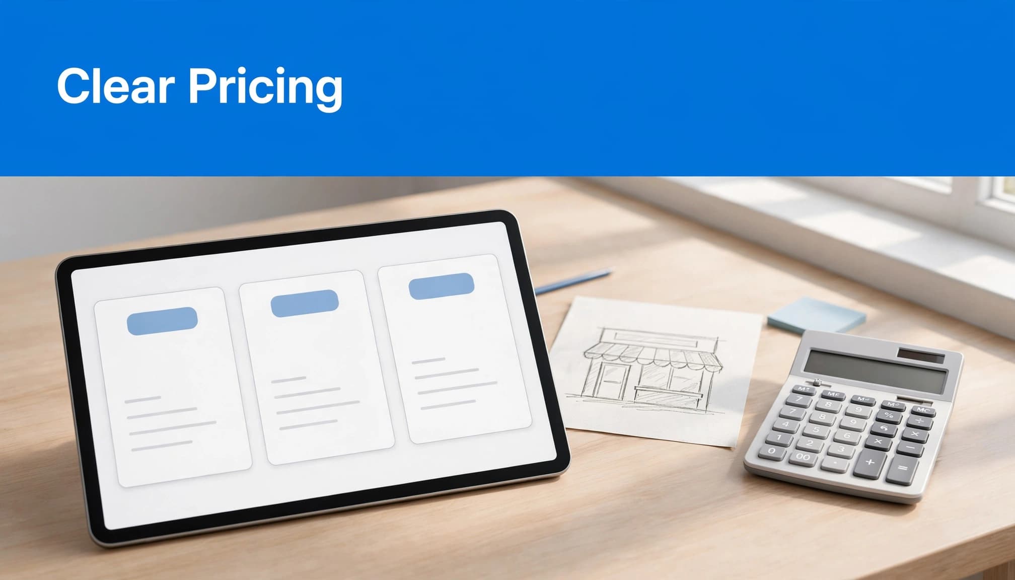
The pricing page image compares three website packages.
Our website packages provide a concrete example of three scope-based choices. The pricing table makes each package’s scope and price easier to compare.
| Package | Published price | Customer fit |
|---|---|---|
| Starter Website | $1,400 to $2,000 | Small businesses needing a focused website |
| Business Website | $2,100 to $4,500 | Businesses and organizations needing broader scope |
| Premium Website | $4,600 and up | Established businesses needing a digital overhaul |
The distinction gives buyers an initial budget direction before discussing individual requirements. Our small business web design packages connect these prices with included services.
Above the cards, add a short headline describing the outcome customers are buying. Good pricing page design shows each card’s intended customer, price, billing basis, main inclusions, and button.
Keep this first comparison near the top. Visitors shouldn’t scroll through your company history before finding the offer.
Pricing Page Examples Worth Studying
I look for decisions that make buying easier on a SaaS pricing page, rather than visual effects that merely make a page memorable.
1. Help Scout and Brex: Clarify Billing Choices
Help Scout’s pricing page illustrates billing-choice design. Its earlier layout used two radio buttons to switch between annual and monthly pricing, highlighting a 20% annual saving.
Brex’s earlier Premium pricing example showed $12 per user per month with a 20% annual billing discount. These are design references, rather than a current purchasing comparison.
What to copy: Show the billing choice beside the price. Annual savings should be visible, but so should the amount charged and the commitment required.
2. Google Workspace, Asana, and Detectify: Explain Trials
Google Workspace’s plan comparison puts its 14-day free trial in the heading and explains pricing models underneath.
Asana’s freemium approach pairs a “Get Started” button with “No credit card required.” Detectify’s pricing-page example announces a 14-day free trial without a credit card in its subtitle.
These details answer different concerns: how long customers can evaluate the service, whether payment information is necessary, and what happens next.
What to copy: Place trial terms near the button. Also explain whether the trial ends automatically or becomes a paid subscription.
3. HubSpot: Separate Payment Timing From Commitment
HubSpot’s sales software pricing illustrates three arrangements: annual commitment paid upfront, annual commitment paid monthly, and month-to-month purchasing.
Monthly payments don’t necessarily mean customers can cancel monthly.
What to copy: Label both the payment schedule and contract length. I recommend placing them together wherever customers select their billing option.
Show the Total Cost for Seats, Usage, and Extras
A pricing card becomes misleading when customers can’t estimate their actual bill. Your page needs to explain the charging unit before presenting a low headline price.
Make Seat-Based Pricing Understandable
For seat-based plans, define a billable user. Explain whether administrators, guests, or occasional users count, and disclose any minimum seat requirement.
An annual plan should show the annual charge, even when its headline uses a monthly equivalent.
A monthly equivalent describes the rate; the amount due tells customers what they’ll actually pay.
For service packages, distinguish the project fee from hosting, maintenance, software subscriptions, and optional marketing. A low build price doesn’t explain total ownership cost.
Explain Usage and Credit-Based Charges
Usage-based offers need an included allowance, a measurable unit, and an overage rule. If you sell AI credits, explain what consumes credits and whether unused credits expire.
A cost calculator can help when several variables affect the bill. However, it should supplement visible rules rather than conceal them.
I also recommend explaining spending limits and what happens when customers reach their allowance. Unexpected charges are a trust problem that attractive pricing cards can’t solve.
Add Comparison Details, Clear Buttons, and Proof
Keep your pricing table concise, then place a feature comparison table below the pricing cards so interested buyers can examine differences side by side. Keep each pricing card focused on the main details.
For software, the feature comparison should cover user limits, storage, integrations, and support. For services, compare deliverables, revision allowances, turnaround expectations, and ongoing support.
Use plain wording instead of unexplained checkmarks. “Email support during business hours” says more than “Standard support.”
Next, match each call-to-action label on your CTA buttons to the actual transaction. “Buy Now” suits an immediate purchase. “Subscribe” fits recurring billing, while “Start Free Trial” promises an evaluation period.
“Get Started” can work for account creation. “Contact Sales” belongs beside a consultation-based offer. Don’t send every button to the same generic contact page.
Near the bottom, add relevant testimonials, customer logos used with permission, genuine reviews, and applicable certifications as trust signals. Give customer logos context, and choose proof that supports a specific plan benefit.
Explain ownership and access where relevant, too. For website services, customers should understand their control over the domain, content, and essential accounts.
Finally, place billing FAQs in an FAQ section near the last decision point. Customers shouldn’t have to leave the page to understand renewal, cancellation, accepted payments, or refund terms.
Make Pricing Work on Phones and in Your Website Builder
A desktop layout isn’t a finished pricing page. Customers need to compare options and take action on smaller screens, too.
Stack Cards Without Losing Context
On mobile, stack pricing cards vertically and keep the same information order in each one. Show the plan name, customer fit, price, key inclusions, and clear, usable CTA buttons together.
Don’t place annual billing details far below the price. Also, make the billing control usable with a keyboard and clearly show its selected state.
For long comparison tables, keep row labels readable. If horizontal scrolling is necessary, make that behavior apparent and avoid squeezing every column into tiny text.
Choose a Template That Fits the Offer
A well-built template makes sense when your packages and purchase path are straightforward. Make sure the pricing page design fits the offer. Custom interface work is more useful for complex quoting, multiple audiences, or interactive cost calculations.
In WordPress, build reusable pricing cards with blocks or a maintained page-builder component. Keep shared billing terms in one editable location to reduce inconsistencies.
When pricing changes, update the page, checkout, and quote forms together. If broader structural changes are necessary, include them in your website redesign budget.
Test the Pricing Page Against Business Results
Mockplus recommends highlighting a recommended plan and testing regularly. I agree with testing, but a recommendation needs a genuine reason.
Use a restrained border or background to identify the plan that fits your main audience. Don’t label it “Most Popular” without evidence.
Before launch, run a short usability check:
- Ask someone unfamiliar with the offer to identify their suitable plan and total payment.
- Have them explain the billing commitment and cancellation terms.
- Ask whether trust signals, such as customer logos, feel credible and relevant.
- Follow each button through checkout or form submission on desktop and mobile. Confirm that submissions reach the person responsible for follow-up.
Then track visits, plan selections, completed purchases, qualified inquiries, and conversion rate. For service businesses, connect inquiries with booked work instead of judging success by button clicks alone.
Test one meaningful change at a time, such as annual-billing wording or the order of package information. Low-traffic businesses often gain more from usability feedback than an inconclusive A/B test.
Frequently Asked Questions
Should a Small Business Offer Annual Billing?
Offer annual billing when recurring service and cash flow justify it. A discount can encourage commitment, but the savings need to fit your margins.
I wouldn’t assume a toggle increases conversions. Explain the annual total clearly, then measure purchases, retention, and cancellations alongside initial signups.
Which Questions Belong in a Pricing FAQ?
Use your FAQ section to answer questions that could stop a purchase, including payment methods, taxes, deposits, renewals, cancellations, refunds, and plan changes.
For project-based work, explain what happens when the scope expands. A focused local service FAQ strategy helps connect those answers with the concerns customers have before requesting a quote.
Give Customers a Clear Next Step
A useful website pricing page makes the offer understandable without forcing customers to decode fees or chase basic answers. I recommend prioritizing clear scope and total cost before adding visual polish.
For a free consultation about your website and SEO needs, Contact Us.
Customers should leave the page knowing which option fits, what they’ll pay, and how to move forward.