

A form submission is a small win, but it can become a lost lead within minutes if the next step feels unclear. The right thank you page ideas confirm the request, set response expectations, and keep each prospect moving toward useful follow-up.
I use the confirmation page as the handoff between marketing and sales, where human follow-up begins. A clear page supports faster responses, better lead quality, and stronger customer relationships without overwhelming visitors. Start by making visitors feel confident that their request reached the right person.
Key Takeaways
- Use the thank-you page to confirm the request, set realistic response expectations, and provide accurate contact information.
- Match the next action to the lead’s intent, such as booking a consultation for high-intent leads or downloading a resource for prospects still researching.
- Connect the page to relevant email follow-up, sales notifications, and segmentation so the conversation stays consistent after submission.
- Track actions that affect revenue, including qualified leads, calls, bookings, email replies, and customers—not only thank-you page views.
- Test one meaningful change at a time and avoid common mistakes such as vague confirmations, unrelated offers, too many CTAs, or missed follow-up notifications.
Why a Thank-You Page Matters After a Lead Converts
A thank-you page has a different job from the page that generated the lead. The landing page earns the submission. The confirmation page keeps the conversation moving.
Confirmation reduces uncertainty
After someone submits a form, they usually want three answers:
- Did the request go through?
- When will someone respond?
- What should happen next?
Answer those questions immediately. A clear message such as “Your estimate request was received” is more useful than a vague “Thanks for contacting us.”
I also include a realistic response window. If a business replies during normal hours, say so. If urgent requests should receive a phone call, provide the number prominently. Immediate confirmation and clear response expectations support user engagement. They also reduce duplicate submissions and prevent prospects from wondering whether they need to try again.
A useful confirmation page can include accurate contact information and response timing, supporting a more trustworthy customer experience:
- A direct confirmation of the request
- The expected response time
- A phone number or email address
- A link to a relevant service or resource
- One clear next action
A landing page and its confirmation screen have different goals
A landing page usually focuses on one conversion. It limits distractions and gives visitors a reason to submit a form, book an appointment, or request a quote.
A confirmation page can support a wider post conversion strategy because the visitor has already acted. However, that doesn’t mean you should add every possible offer. The broader post conversion strategy still needs one primary purpose.
For example, a roofing company might use the landing page to collect an inspection request. This page can explain what happens during the inspection, link to a preparation guide, and provide a phone number for urgent questions. It shouldn’t push unrelated gutter products before the company has responded to the original request.
Build a Thank-You Page That Starts the Conversation
One of the most useful thank you page ideas is to make the page feel like the first helpful reply, not an automated receipt.
Confirm the request in plain language
Match the confirmation message to the form the visitor completed. “We received your website repair request” is stronger than “Your information has been submitted.”
After a visitor completes the contact form, use the confirmation page to explain what your team received and what happens next. I prefer a short headline followed by two or three sentences. If the form collected a preferred contact method, repeat it when appropriate, but avoid displaying private information on a public page.
A service business could write:
Thanks for requesting a plumbing estimate. I received your project details and will review them before calling during the next business day.
That message is specific without promising an unrealistic deadline. It also gives the visitor a reason to wait for a personal response.
Make the Next Steps Easy
The next action should fit the lead’s level of urgency. A person requesting emergency water damage help may need a phone call now. Someone downloading a buyer’s guide may need education before booking a consultation.
Use descriptive button text such as:
- “Call for Emergency Help”
- “Book a Consultation”
- “Download the Planning Guide”
- “View Service Options”
Avoid generic buttons such as “Continue” or “Submit.” Clear wording tells people what will happen after the click. My conversion-focused website content follows the same principle: the call to action should match the visitor’s actual need.
Match Follow-Up to Lead Intent
A confirmation page works better when it reflects the prospect’s position in the buyer journey. Someone asking for pricing needs a different follow-up path than someone downloading an educational resource.
Ready-to-buy leads need a direct path
High-intent leads often submit a quote request, consultation form, or appointment request. After confirming the submission, give them a fast way to continue.
A local contractor could add a scheduling link, a phone number, and a short explanation of the estimate process. A marketing firm might offer a calendar link for a discovery call. A dentist could show appointment preparation details and directions.
I keep these pages focused. One primary call to action is usually enough. A secondary link to a related service can work, but five competing buttons make visitors decide what matters.
Social proof can support the next step when it stays relevant. A short testimonial from a customer with the same type of problem is more useful than a rotating wall of unrelated reviews.
Researching leads need useful information
Some leads aren’t ready to speak with a salesperson. They may download a checklist, subscribe to updates, or request a guide. The confirmation page should deliver the promised lead magnet directly.
A visible download link matters because email delivery can be delayed, filtered, or overlooked. I provide the resource on the page and repeat the delivery details in the follow-up email.
Then I offer one related action. Someone downloading a website planning checklist might be invited to review service packages. Someone requesting a home renovation guide might see a gallery or project preparation page.
The page should move the prospect one reasonable step forward. It shouldn’t force a sales call before trust has developed.
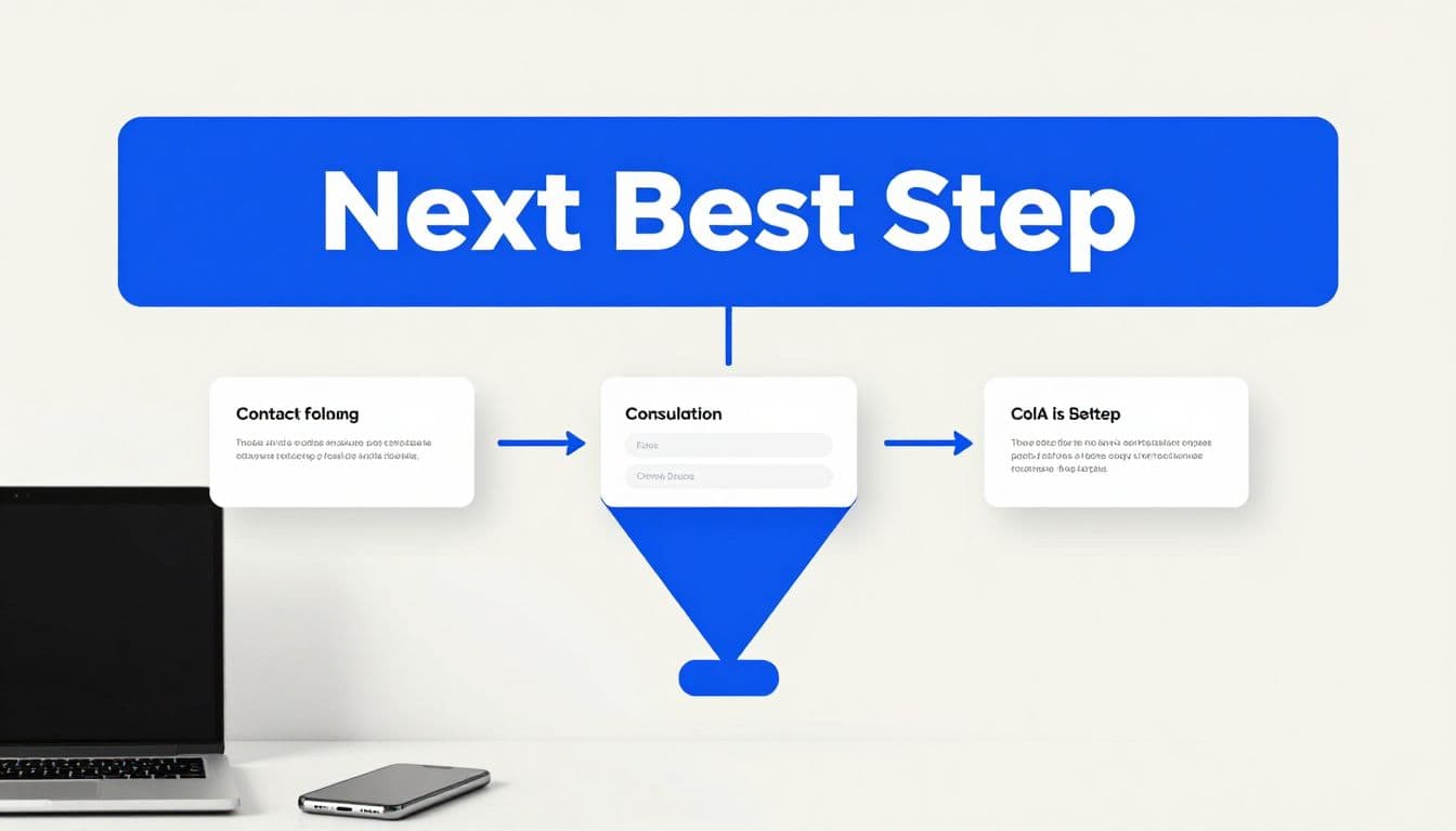
Turn Confirmation Into Useful Follow-Up
The page is only one part of the customer journey. Its strongest results come when the page, email system, and sales process use the same message.
Connect the page to a short email sequence
Send the first email soon after the form submission. It should confirm receipt, repeat the expected response time, and provide any promised resource. Don’t make the visitor search through several paragraphs to find the next step.
For a service lead, a short sequence might look like this:
- The first email confirms the request and gives contact expectations.
- A later email answers a common question related to the requested service.
- A final message invites the prospect to schedule a call or reply with details.
Your automated email marketing sequence should align with the sales notification. It should stop or change when a salesperson makes contact. Otherwise, the prospect may receive generic marketing messages while already speaking with your team.
I also segment leads by form type. A request for PPC advertising shouldn’t enter the same follow-up series as a website maintenance inquiry. Relevant messages improve response quality and make the business sound attentive.
Use referrals and offers at the right time
Referral requests work best after a successful experience, not immediately after an initial inquiry. A referral program feels more natural during a later post-purchase interaction. Introduce it after the client completes a project or receives a clear result. This timing supports customer retention and brand loyalty because both grow from earned trust.
For ecommerce or service payments, a purchase confirmation page can show a related product or service. Keep it connected to the original purchase, so relevant upsell opportunities can support customer lifetime value over time. A natural cross sell might pair a maintenance plan with an annual inspection offer. A person who requests an estimate probably doesn’t need an unrelated discount code yet.
When I use an offer, I state its terms plainly. Relevant discount offers should state the expiration date, what they apply to, and how the customer redeems them. A limited-time offer should add value, not pressure the customer before the original request receives attention. It shouldn’t suggest an unrelated discount code.
Track What Happens After the Form
Thank-you pages make lead tracking easier, but only when the setup distinguishes real conversions from simple page visits.
Measure actions that affect revenue
I track more than thank-you page views. These measures provide the evidence needed for conversion rate optimization:
- Form completions by source and form type
- Calls and appointment bookings after submission
- Download clicks
- Email replies
- Qualified leads
- Leads that become customers
A visitor may reach the page but never schedule a call. That difference matters. If the page receives traffic but few next-step clicks, the message or CTA needs review.
For digital marketing campaigns, Google’s web conversion measurement guidance explains how businesses can track actions such as form submissions. I also use Google Analytics 4 lead tracking to connect form completions with calls, appointment requests, and other actions.
A thank-you page URL can trigger a conversion event, but test it carefully. The event should fire after a genuine submission, not when someone refreshes the page or visits the URL directly.
Review the full response process
Analytics can show where people click, but your lead records show whether the process produces business. Compare the source, service requested, response time, and final outcome across the sales funnel.
If leads arrive but few receive a reply, the problem may be operational rather than visual. If people click the scheduling button but abandon the calendar, review the booking experience. If one form generates many unqualified inquiries, improve the questions or clarify the offer before changing the thank-you page.
For technical work, I prefer SEO-focused website design and maintenance that keeps forms, tracking, mobile layouts, and contact details working together. A polished confirmation page cannot repair a broken form or a missed sales notification.
Test and Improve the Page Over Time
Small businesses don’t need a complicated testing program. One clear change at a time provides a straightforward conversion rate optimization method with a reliable baseline.
Test one meaningful variable
Start with the page headline, response-time message, call to action, or resource placement. Test wording that matches response urgency or the visitor’s intended next action.
For example, test “Request Received, We’ll Call Next Business Day” against “Your Estimate Request Is In.” Keep the form, traffic source, and follow-up process consistent during the test.
Review enough leads to identify a pattern. A single day’s result can be noisy, especially for local businesses with seasonal demand. Compare qualified leads and booked work, not only button clicks.
Avoid Common Confirmation Page Mistakes
The most frequent problems are easy to correct:
- Sending visitors to a blank page with no confirmation
- Promising a response time the business can’t meet
- Hiding the promised download inside an email
- Showing unrelated products or services, or an irrelevant discount code
- Adding too many CTAs, social icons, and navigation links
- Forgetting to test the page on a phone
- Failing to notify the person responsible for follow-up
I also check that the phone number, email address, hours, and service details match the rest of the website. Accurate information supports trust and prevents avoidable delays.
Frequently Asked Questions
What should a thank-you page include?
A thank-you page should confirm that the request was received and explain when someone will respond. It can also include accurate contact information, a promised download, and one relevant next action.
What is the best call to action for a thank-you page?
The best call to action depends on the visitor’s intent. High-intent leads may need a scheduling link or phone number, while researching leads may benefit from a guide, service page, or project resource.
Should I deliver a lead magnet on the thank-you page?
Yes, provide the promised resource directly on the page whenever possible. Repeat the delivery details in the follow-up email because email messages can be delayed, filtered, or overlooked.
How can I track whether a thank-you page is working?
Track form completions, next-step clicks, calls, bookings, email replies, qualified leads, and customers. A page view alone does not show whether the follow-up process is producing business.
How often should I test a thank-you page?
Small businesses can test one meaningful variable at a time, such as the headline, response-time message, CTA, or resource placement. Compare qualified leads and booked work over enough submissions to identify a reliable pattern.
Conclusion
Strong follow-up pages make the next steps obvious while a lead is still engaged. Confirm the request, set a realistic response expectation, deliver what was promised, and offer one relevant action to support customer retention.
Then connect the page to email, sales notifications, and reliable tracking. When a small business treats the page as the start of follow-up, each form submission has a better chance of becoming a real conversation. If your website needs a clearer contact path, Contact Us for a free consultation about your website and SEO needs.